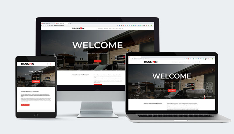
So, as you might have noticed, we’ve redesigned our website.
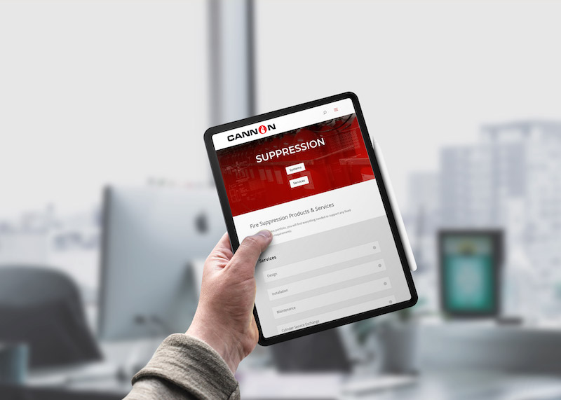
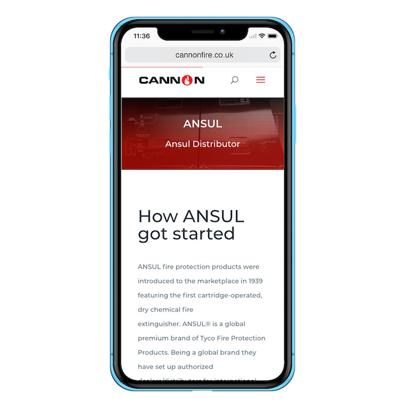
We were long overdue a website overhaul. We saw it as an opportunity to make a more informative website by describing in more detail what we do as well as who we do it for.
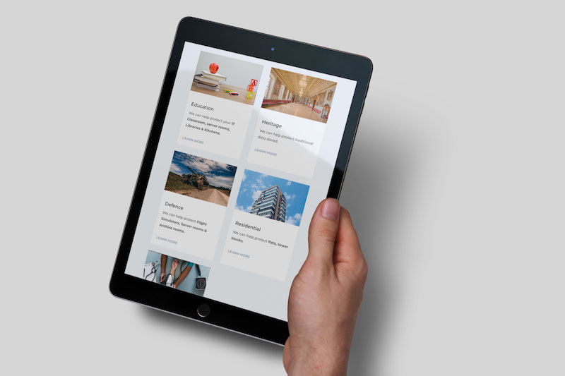
We also have a page showing our accreditations, the services we provide as well as the sectors/markets we provide services too, this section contextualizes the information and gives a reader an idea of the type of system we would recommend (environment depending).
We also have put together a newsletter webpage where visitors can subscribe to our monthly e-newsletter and once a month you will receive an email containing the best news from Cannon.
Nicholas Michael, Picnic Designs said the following…
“Upon starting this project two things struck me, 1. What did Cannon do? (beyond putting out fires)
The original site had a page that simply listed their services including things that were no longer available and there was no explanation on the site as to what the systems/services did and who they were for. So, to correct this, we have now got the ubiquitous sectors section on the website.
2. What did the website say? Coming from a graphic design background I value legibility and accessibility, If it is hard to read then it is hard to sell. The old websites black background and small white text resulted in a very high contrast webpage, that was difficult to read. (screenshots below).
In addition, all page content was counter-intuitively forced into the bottom right corner of any given page.
Western audiences read from left to right, the previous website placed the contact form and twitter feed as the left most objects making it, so these were seen first, as though they were more important than the page content. (The twitter feed is more visible than the main page content). I could talk all day about the various things we changed, but to put it simply, I hope you enjoy the new website.”
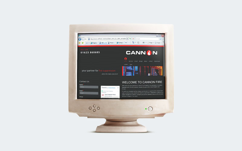
The new site is much more user friendly for both a reader and us! So as a result, expect to see a lot more updates from Cannon Fire. Stay connected with Cannon Fire via our social media pages. If you haven’t taken the opportunity to visit our social media, please do so. It’s a great way to interact with us, twitter and linkedin.
About Cannon Fire Protection
With over 30 years experience, Cannon Fire Protection has developed an excellent reputation within the fire protection industry throughout the United Kingdom and Europe. Independent auditing of our quality management systems, contracting and service operations ensures the very best provision of support in our sector.

Request A Quote
Have a project or portfolio that you would like to work with us on? Get in touch and a member of our team will be in touch very shortly..
Our two head offices are based in Birmingham and Ollerton with fully qualified, experienced engineers spread throughout the UK allowing Cannon Fire to operate nationwide.
Call Us: 01623 860685
Email Us: [email protected]
CONTACT DETAILS
Trading Offices
Unit 1 Sherwood Network Centre, Ollerton, NG22 9FD
Unit C, 37a Parkfield Road, Coleshill,
Birmingham, B46 3LD
OUR KEY SERVICES
Copyright © Cannon 2024 All rights Reserved